Importance of early diagnosis
Educating healthcare professionals for a more accurate diagnosis of early stage Alzheimer’s disease.

Overview.
ID/AD is an initiative by Biogen to raise awareness of Alzheimer’s disease early signs and symptoms and the importance of accurate diagnosis for timely brain health interventions. I led the design of the site targeted at healthcare professionals to provide content heavy education material in a meaningful and easy to consume way.
ROLE & DURATION
UX & UI Designer - Information Architecture, Illustration, Visual Design, Prototyping
February - August 2021
CLIENT
Biogen
WEBSITE
Project goals.
Relay critical information in a memorable way.
Biogen being a leader in the field of Alzheimer’s disease had a very dense content brief to start with. The challenge for me was to design the content and layout in an engaging and easy to consume way without losing any essential information.
Relay hope in light of an incurable disease.
The main message is early detection and diagnosis as a means to reduce severe Alzheimer’s disease. The UI and visual data design should also help to convey that message and hopefully inspire action and further sharing of knowledge amongst the professional field.


The challenge.
Strong opinions about design, layout and hierarchy from different stakeholders proved challenging when trying to strike the balance between good UX principles and content design.

Key design decisions.
Data visualization.
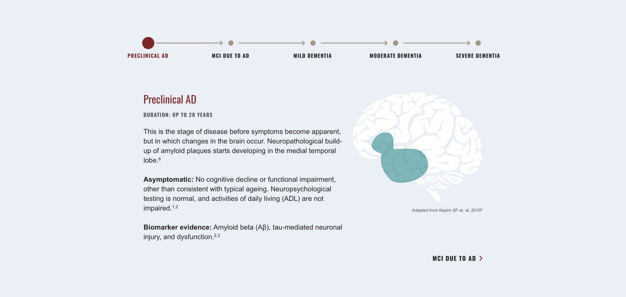
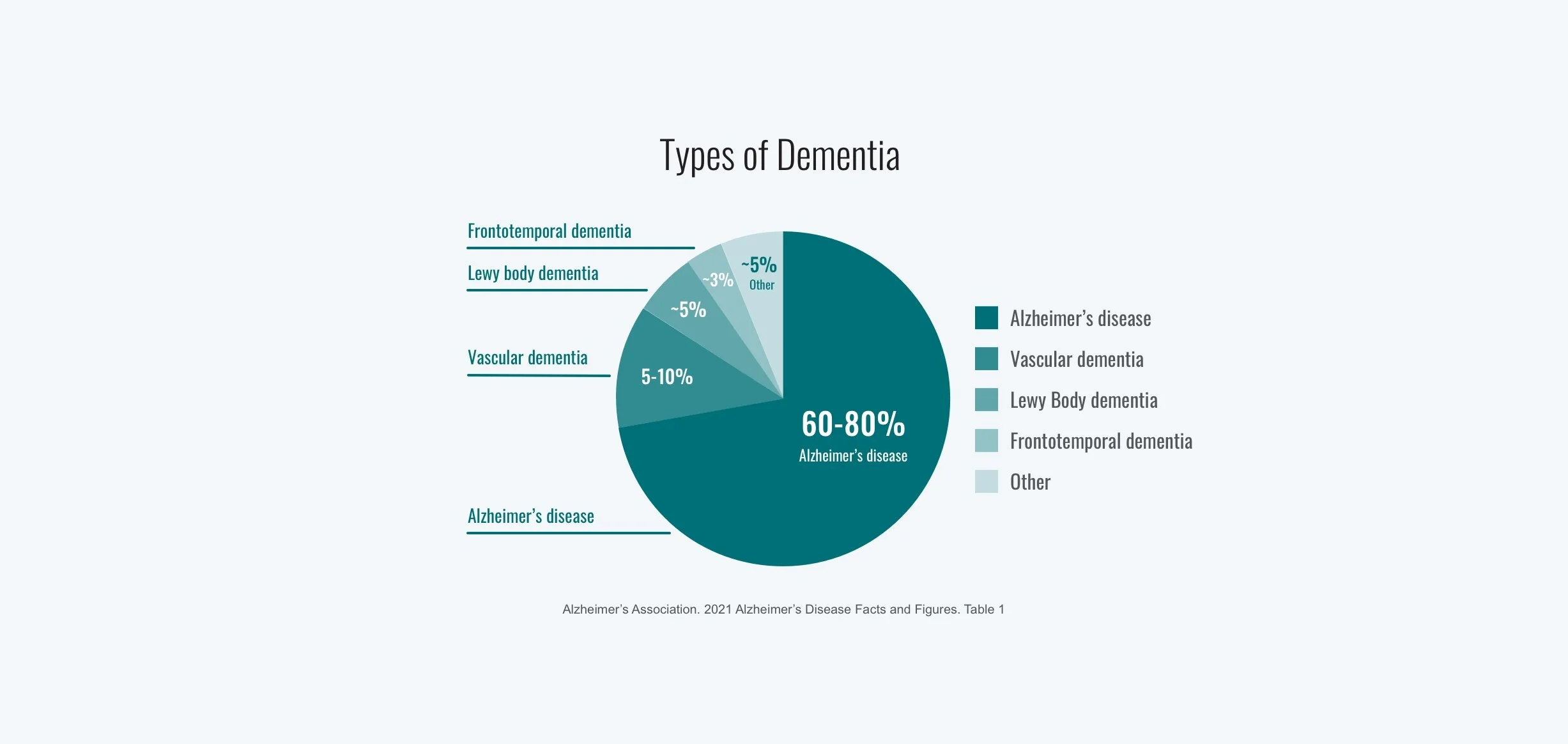
I curated the data into the form of infographics, charts, and interactive visuals to highlight the key content and relay the content in a more engaging way. This helped to greatly reduce the amount of copy upfront and the materials were able to be reused in parallel campaigns and publications.
Applying psychology principles.
To guide a subjective conversation around the design layout and hierarchy of information, I applied a number of psychology principles:
Hick’s law - To reduce the complexity of choices, content was further grouped to decrease cognitive load. This was applied to the infographics and number of items in a section.
Progressive disclosure - To increase adoption of complex features, only the highlighted content was shown first before revealing the rest of the content. This was translated into accordions and dropdown features throughout the site.
Law of common region - Elements sharing the same boundary will be perceived as a group. This was applied in the lengthier pages where content and infographics were stacked and needed to relate to each other for context.
Outcomes and learnings.
I enjoyed the challenges and restrictions that came with designing this website. I had to fight for good UX throughout the project and communicate the justification for not going in a specified design direction. As a designer it’s always important to make informed decisions and help bring clarity and confidence to the work.


